App Flow Overhaul
Benchmark Email
SaaS
//
B2B Digital Marketing App
Consolidated two complex multi-step processes into one flexible workflow.

Background
Benchmark Email, now owned by Polaris Software, is a B2B digital marketing platform serving SMBs globally in 9 languages.
Research during the product’s redesign revealed recurring pain points in the app’s core email workflows, uncovering opportunities to improve key customer experiences and new sign-up activation.
I secured stakeholder buy-in and replaced two four-step email processes with one flexible workflow. This enabled customers to manage settings and send from a single page while maintaining a separate workspace to design their email content.
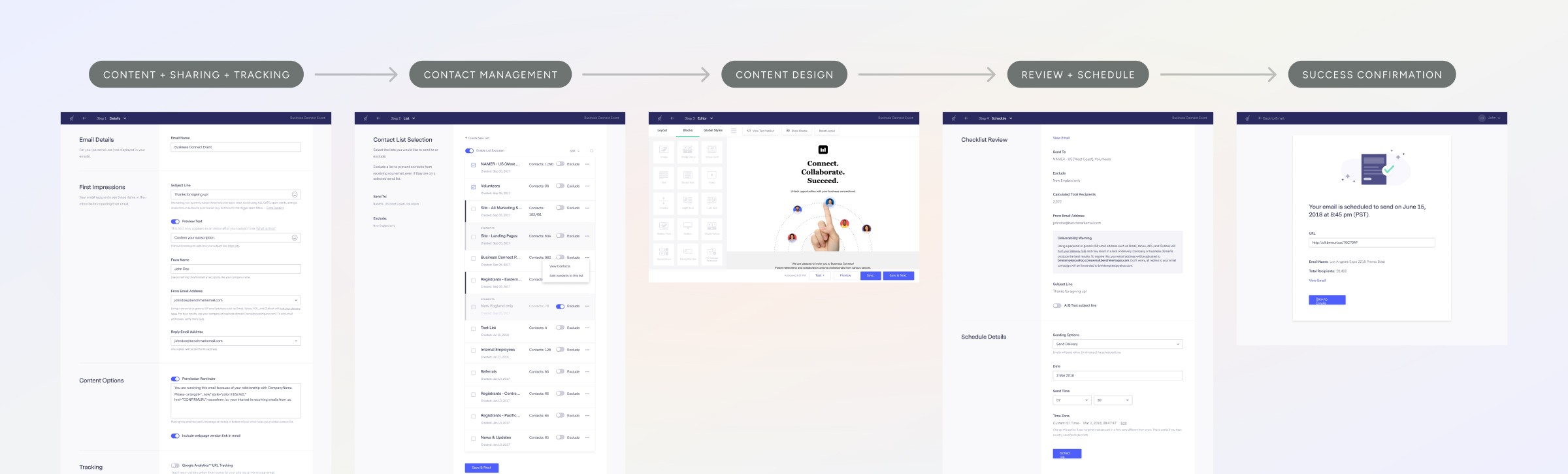
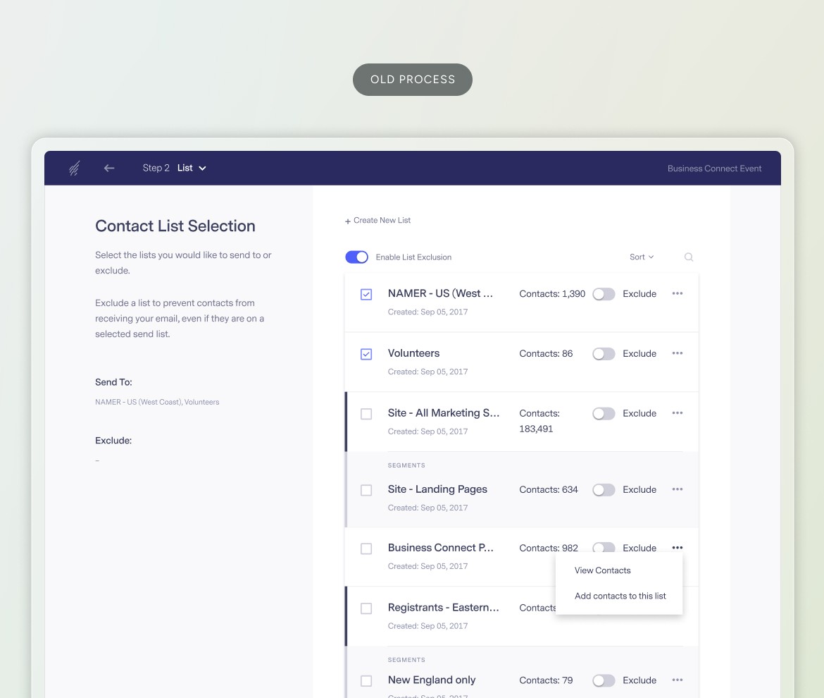
One of the step processes to create email campaigns
Challenges
This project involved several layers of complexity. I needed to design for two email types, seamlessly embed supporting workflows into the main flow, create multi-editor compatibility, and support localization. On top of that, I worked to safely remove technical dependencies that forced customers into fixed sequences, freeing them to work in any order without losing data or feature power.
My Role
As senior product designer, I co-led the team alongside a senior engineer. I was the sole designer collaborating with a researcher, engineers, and stakeholders across multiple time zones and countries. Owning end-to-end processes from concept to launch, I also wrote content and coordinated across departments to drive transparency and touchpoint cohesion.

Multilingual product localization
Approach
Combined qualitative and quantitative data to understand where customers struggled
I analyzed customer support tickets and partnered with a researcher to gather product analytics. Some recurring pain points included frustrations with missed details, excess clicks, and paths leading out of the email process that contributed to activation drop-off.
Balanced customer simplicity with technical constraints
I collaborated with engineers to leverage existing APIs and design system components to create conditional logic, contextual messaging, and integrate supporting workflows into the main flow.
Created phased rollout strategy to validate with customers
To minimize risk for existing customers and gather validation data, I created a phased rollout strategy, testing and iterating the simplified workflow with new customers before launching to all accounts across 9 supported languages.
Launched Solution
Simplified into a straightforward process
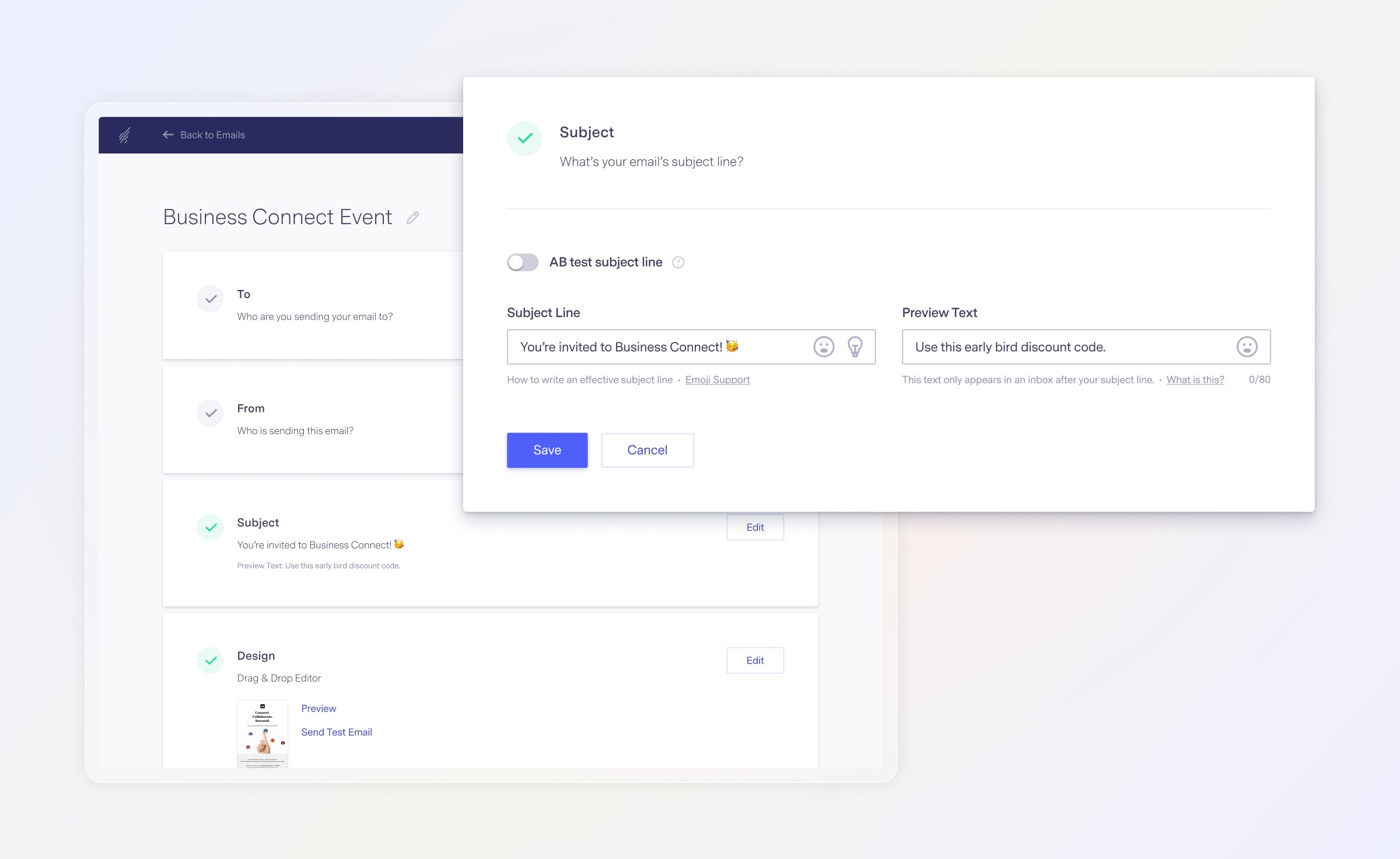
I condensed the email setup and send settings into a single page, restructuring information into accordion sections to reduce cognitive load. This made it easy for customers to navigate, quickly edit their settings, and work in any order instead of a fixed sequence.
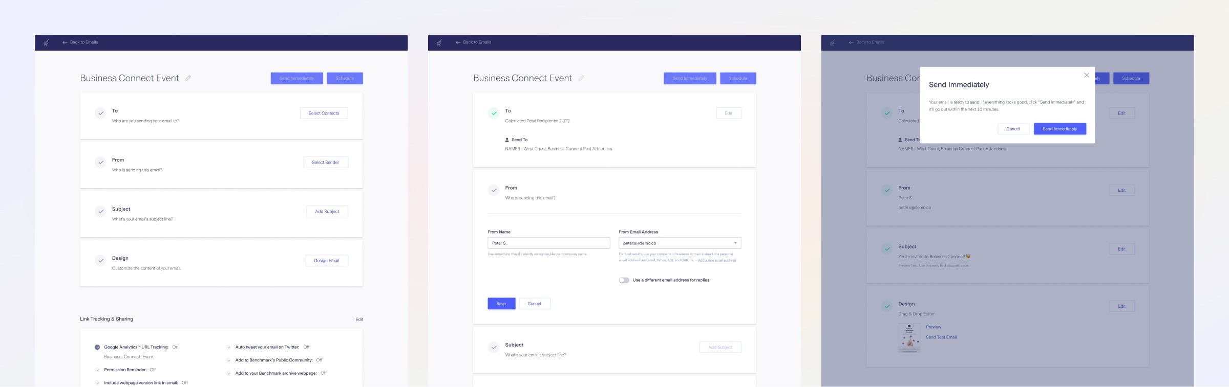
Condensed the process into one page
Balanced workflow flexibility with guardrails
Compatible with all editors
Continuity and consistency built predictability
By repeating UI components and UX patterns, I created familiar behaviors and conditional messaging. This allowed customers to intuitively navigate and create multiple email types within the same flow, while keeping the design scalable.
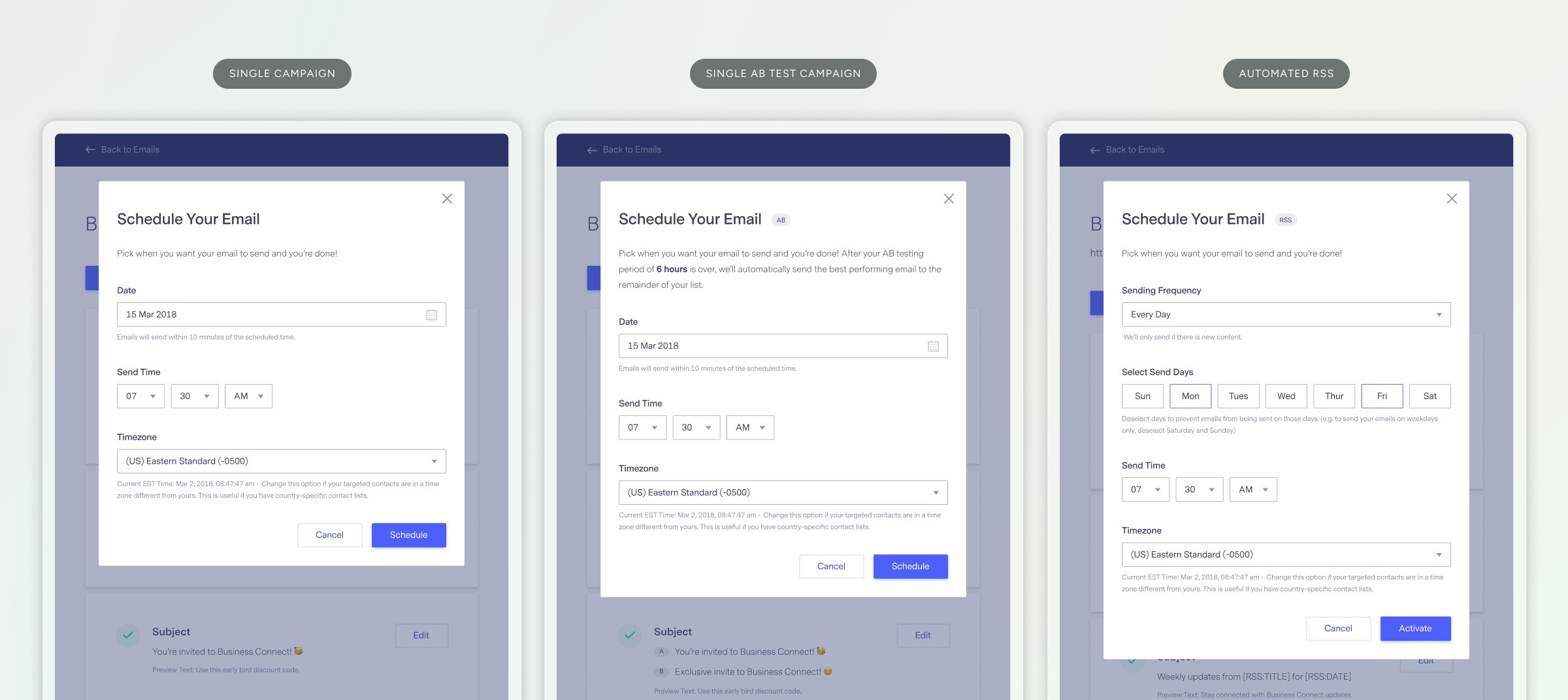
Created conditional logic to leverage component variations
Reduced persistent friction
I reorganized information hierarchy and improved controls to align with customer behaviors and feedback, which reduced recurring friction with searching and selecting contact lists.

Simplified flows by creating new, scalable modules when necessary
Integrated supporting workflows to minimize disruptions
To help customers complete tasks without leaving the page, I integrated supporting workflows into the main flow, using existing APIs to keep the experience consistent across the product.

Embedded supporting workflows and automated selections
Validation and Impact
Increased efficiency by more than 2x
The new workflow increased efficiency by more than 2x, reducing time from ~35s to 16s to make a single edit and then send. The time saved continued to compound with every new email that was sent or scheduled.
Customers consistently rated the new flow as easy
In addition to product analytics, I created post-completion surveys to gather direct feedback from new sign-ups and measure the new flow’s ease of use. New customers rated the experience as an average 5.89 out of 7 over the first 3 months, exceeding the goal of 5+. It sustained a strong performance of 5.84 average over 6 months.


This isn't a support issue, just wanted to say that the recent change to the [email checklist] UI is a big improvement, makes it much easier to input a mailing's settings and review them for accuracy all on one page.
Irene Nash
//
Aug 2019
We love your new look and interface feel for sending bulk email. It’s user friendly, avoids errors and easy to make changes just before sending. Kudos to your technical team and the rest of the team!
Sylivia Spencer
//
Aug 2019
Reduced maintenance cost
By collaborating closely with engineers, I streamlined business logic and reduced maintenance costs by consolidating 7 pages into 1. This workflow's modular structure allowed teams to run quick experiments and created a scalable foundation that other product teams used to later launch the app’s landing page feature.
Created accurate product signals
Implementing better analytics, the simplified flow's launch established accurate data baselines for measuring time-to-first-send and uncovering activation patterns that informed future product and growth decisions.